Note: Eric Merrell teaches a class–Seeing Beautiful Color in the Landscape–May 14-16, 2014, in Pasadena. Deserts pose a “wonderful problem” when it comes to observing color, he says. Here are ideas on how to tackle the problem, from one of the most poetic painters of the California deserts.
I really began to develop some of the color ideas during my Joshua Tree residency in 2009. In the desert in summer, especially in JT, there are strong shadows early in the morning and late in the afternoon, but for 5-6 hours when the sun is overhead there is hardly a shadow for miles.
After struggling with it for awhile, I realized that when the shadows disappeared I lost artistically the ability to use value contrast (lights and darks) in a painting, but I still had color contrast. During the middle of the day (as in moonlight), we can still perceive distance, the masses and forms of boulders and trees, and the world continues to exist in three dimensions without the help of shadows (value), so I began to see that color was the way to try to convey that sense of light. One begins to mix all sorts of interesting colors to try and solve the problem. Painting is really problem solving.
These color ideas apply to any situation and any location. But the particular brightness of the desert, where everything exists in such a high-key situation – sand, mountains, sky, brush – it provides a wonderful problem for exploring the richness of color. Just as a white tablecloth reflects the ‘truest’ colors of outdoor light (when we look at something ‘white’, we are seeing the full spectrum of visible light), the desert reflects a great deal of light back to our eyes, back into shadows.
Students in my workshops often comment to me that they see color afterwards that they didn’t see before the workshop. When we study our visual world and what we see in terms of color and paint it is like exercising a muscle: the more often you use it, the stronger it becomes. In the scheme of art history, it also makes sense that our use of color continues to become more and more sophisticated.
Color is a way we interpret our perceptions – truthfully, painting is another language, and not at all related to photography (which is itself another genuine art form). I think it is a language that almost everyone in the world understands, with its ability to bridge cultural barriers, because we all live in a color-filled, three-dimensional world, but most people are not very fluent in it (for many reasons).
In her fascinating book Color, Victoria Finlay remarks that the section of wavelengths that we can see, visible light, includes about ten million variations of color. So the more colors I have on my palette, the more variations I can mix, and the more subtle my vision can become. As well as being descriptive, I can also use those colors to provide an emotional element.
Finlay’s book is about the history and cultures surrounding actual paint pigments. The part I like most, though, is the idea that objects don’t have a static ‘color’ – they’re constantly changing throughout the different light of the day and over time. An orange carrot in the dark isn’t orange.
As Finlay writes: “The best way I’ve found of understanding this is to think not so much of something ‘being’ a color but of it ‘doing’ a color. The atoms in a ripe tomato are busy shivering – or dancing or singing; the metaphors can be as joyful as the colors they describe – in such a way that when white light falls on them they absorb most of the blue and yellow light and they reject the red – meaning paradoxically that the ‘red’ tomato is actually one that contains every wavelength except red. A week before, those atoms would have been doing a slightly different dance – absorbing the red light and rejecting the rest, to give the appearance of a green tomato instead.”
I’ve been compiling some thoughts as a way for me to better understand color myself, because it’s so multi-faceted. Cezanne was spot-on with his observation that “Painting from nature is not copying the object, it is realizing one’s sensations.” Here are a few notes:
- Painting involves all the senses, not just sight. Sound plays a big role: One of my favorite parts of painting in the desert is crunching through the sand to my location. Also, when painting at night where our visual perceptions are reduced, audio increases and even small noises are very noticeable, like a lizard scooting by.
- There is no such thing as “local color.”
- Society today is so heavily bombarded by photography, film and other mechanical forms of art that we accept it as unbiased truth and don’t look any further or deeper (an individual camera lens doesn’t ‘see’ the same way our eyes do, in stereo, and a photograph can be incredibly biased. Painting in many forms has become a sub-category of photography, aimed at technical prowess, not in its own realm.
- ‘Color’ is a man-made invention, as is the concept of value. These terms are helpful to us in understanding what we’re seeing, but it becomes very hard to get away from names (i.e., a tree is brown and green, the sky is blue, rocks are gray) – what color is a ‘green’ tree in moonlight?
- Artists rely too heavily on science to ‘explain’ what they’re seeing instead of developing an eye for color. Art shouldn’t need an explanation. It’s interesting to know, but the scientific reason for why mountains appear bluer as they recede into the distance isn’t necessary to artists. The relationships between the colors however is very important – because, in other words, artists shouldn’t be painting a solely objective scientific vision of the world but should include their own subjective vision with all of the variables that entails.
- Have confidence in your opinion.
- We don’t have many historically-based examples of artists using rich color because stronger pigments weren’t available until fairly recently, so artists like Rembrandt had to rely much more on value. Aside from the recent history of Impressionism, when stronger color is used it tends to move away from perceived light in the natural world towards Expressionism or Fauvism, where color is ‘liberated’ from its role (i.e. when AndréDerain paints a bridge, he might paint it bright Cadmium Yellow.) If Rembrandt were alive today, I’m pretty sure he would take advantage of as many contemporary colors as he could, but his earthy palette was a result of the time he lived in.
- When someone looks at a painting with color, they tend to single out one spot of color – especially if they can name it, say a blue shadow – and look for that individual color in the landscape. Color doesn’t exist in a vacuum like that – that spot of blue is very purposefully placed next to whatever colors surround it, just like in the landscape.
Merrell Looks at Color in his Own Paintings
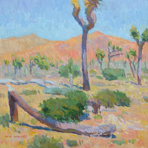
A couple of these paintings are very dependent on color contrasts – The Heat Lingers at Dusk was done after sunset.
The rocky hill is silhouetted strongly against the sky in terms of value, but the greens of the Joshua Trees were visible in front of that and help create more atmosphere. There is space and depth between the Joshua Trees nearest us and the further hill. We can see the color shifts, but we really can’t see any defining features of the spiky Joshua Trees. Also, the hill is still 3-dimensional, so I needed subtle color shifts to convey the idea that the hill recedes away from us as we look up towards its peaks, angling in space.
The Face in the Sand was a challenge – I could see SO many colors shifts in the shadow, but in the painting those colors have to exist in the shadow realm for it to work.
It’s counter-intuitive to think that yellow can be a shadow, and ‘dark,’ because we think of yellow as a light ‘warm’ color. All that matters are getting the relationships correct. I try to ask myself what the light is doing, and find some of the color solutions that way. If the yellows were to get too light in value, they would begin to read as part of the sunlit sand on the ground.
Snow Creek Canyon was done on a somewhat overcast morning, but this also needed to show a shift as we visually climb the mountain. The warmer salmony colors towards the base shift towards violets and greens as it gains elevation, shifting and turning away from us.
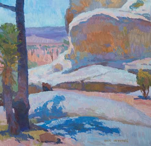
Shadow of Where a River Once Was, a nocturne, also relies heavily on color contrast. The first impact is value-based with the brightly lit boulders in the foreground alongside a dark shadow, but then our eyes wander up and back into the canyon.
It gets softer and softer, but our eyes can still perceive these little shifts, and value is unable to help us in that arena where it becomes incredibly soft. I’m trying to convey this softness by shifting and playing the colors off of each other while staying in the same value. The sky here is made up of bluish- and reddish-violets, violet-greens, and colors that go beyond naming, but are all relative to the other colors of the painting. Many people including artists think I’m a little nuts for painting in the dark, but if you stand in the moonlight for awhile, your eyes will adjust and you’ll see all sorts of things.
The other pieces have some value contrast in them, but I’ll often use those areas as anchors in a painting to explore other color contrasts. The central Joshua Tree in Echoes and Silence is grounded by its shadow, but I wanted to use that to get to the hill behind it, the bright orange-ochre with shifts towards red and violet, against the sky. It really looked like that, and could have been done without the tree, but that value contrast kept it from getting too abstract in this instance.
Our ability to perceive quality in nature begins, as in art, with the pretty. It expands through successive stages of the beautiful to values as yet uncaptured by language. –Aldo Leopold
I like this quote by Aldo Leopold, which to me is encouraging us to dig deeper artistically. Sunsets, flowers, late afternoon sunlight are all beautiful subjects for painting, but there’s more. Artists have more tools today than artists working 50 or 100 years ago. I think we can go beyond what our artistic forefathers did, in terms of color, composition, and impact. We need to expand our color beyond the predictable and into those areas “as yet uncaptured by language.”
Eric Merrell is a Signature Artist Member of the California Art Club, and a historian for the club. For more on his work see: http://www.ericmerrell.com
For information on Eric’s workshop: http://www.californiaartclub.org/2014/02/cac-master-artist-workshop-with-eric-merrell/


A really interesting article that all desert painters will appreciate and identify with.
Beautiful bright, bold colours. Creating contrast is never easy but you have captured it wonderfully; your work reminds me of a mix of Van Gogh and Georgia O’Keefe; O’Keefe in particular mastered desert paintings.
http://www.canidaeart.com
Interesting read Eric. Glad you’re exploring uncharted waters out there in the desert.
Lee
Very interesting article. I have been following your work. It is very impressive and love your color! You are among the best.
a masterpiece of a brilliant mind…..oiy and he paints too!
Thank you for your thoughts, Eric. Especially intriguing are the notes – having confidence in one’s own opinion is key. (Also loved the declaration that there is no local color!)